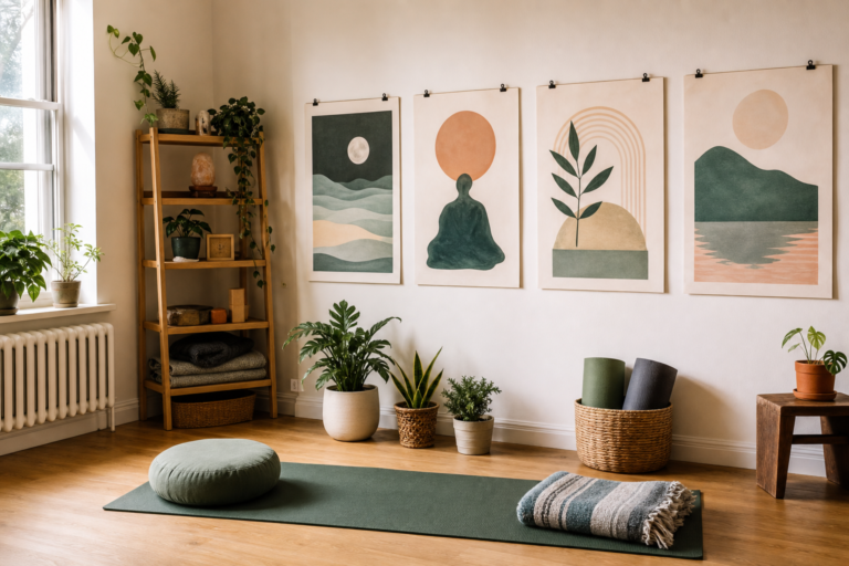
A restful room is not created by color alone, but color is one of the fastest signals the body reads. Before you open a meditation app, roll out a yoga mat, or sit down with a journal, the room has already set a tone. Bright clutter can make a space feel busy. Muted, balanced colors can make it easier to exhale.
For a wellness space, the goal is not to chase a perfect trend palette. The goal is to choose colors that help the room support the way you want to feel and behave: grounded, focused, calm, awake, or ready for recovery.
Think in color jobs, not just favorite colors
A color can do a job in the room. One shade can soften the background. Another can mark a focal point. A third can connect printed materials, a journal, a towel, or a mat so the space feels intentional instead of accidental.
This approach is especially useful in small apartments or shared rooms. You may not be able to repaint a wall, but you can still repeat a calming color palette through portable objects: a cushion, a framed print, a habit tracker, a blanket, or a small storage basket.
Build a calming palette before buying anything
When you are moving from digital inspiration to real room accents, journals, and printable wellness materials, Hue.ink can help make a calming color palette easier to explore before you commit to digital-to-print color choices.
Start with three roles. Choose a base color for the largest surfaces, a support color for soft goods, and one accent color for small details. The accent should be useful, not loud. In a meditation corner, that might mean a deep green notebook or a clay-colored candle holder rather than a sharp neon object.
Try the palette in the actual room before you expand it. Morning light, evening lamps, wood floors, and nearby furniture all change how a color feels. A shade that looks peaceful online may become too cold, too yellow, or too intense once it meets the rest of your space.
Room-by-room guidance
Meditation corner
Use low-contrast colors around eye level. Soft gray-green, warm white, muted blue, or gentle clay tones can help the corner feel separate from the rest of the room without making it dramatic. Keep the main focal point simple.
Yoga and mobility area
Choose colors that make movement equipment easy to find but not visually aggressive. A mat, blocks, and towel in related tones can make the area feel organized and ready for a short session.
Desk or journaling station
Use a slightly clearer accent color for focus. This can be a pen cup, a notebook cover, or a small print. The color should guide attention without pulling you into screen-like brightness.
Bedside recovery zone
Keep the palette warm and dim. Avoid strong contrast near the bed if the area is meant for sleep, evening breathing, or low-energy reflection.
A quick checklist for calmer color choices
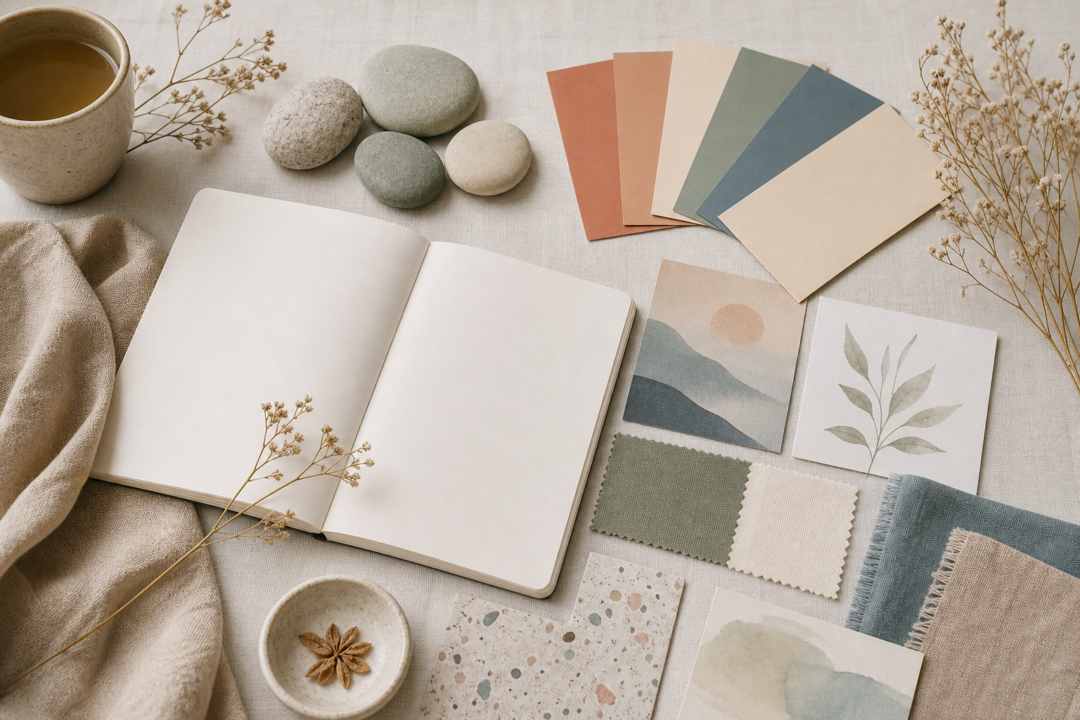
- Repeat one color in at least three small places so the room feels connected.
- Use matte or natural textures when possible; they usually feel softer than glossy surfaces.
- Leave some visual breathing room instead of filling every surface.
- Test printables in daylight and evening light before deciding they are final.
- Keep high-energy accent colors away from the main meditation sightline.
- Choose one grounding neutral so seasonal accents do not make the room feel scattered.
Digital-to-print color needs a little patience
Colors shift between screens, paper, fabric, and wall paint. A gentle beige on a laptop may look yellow under warm bulbs. A soft blue poster may feel colder once printed. For wellness materials, small test prints are worth the time because the final effect depends on the room, not only the file.
If you are creating habit trackers, breathing cards, or small posters, keep contrast readable while staying quiet. Pale text on pale color may look refined on screen but become hard to use during an actual routine. Calm design still needs practical clarity.
Texture matters here too. The same color can feel different on smooth coated paper, recycled paper, cotton fabric, or a painted wooden frame. For a restful wellness space, tactile softness often supports the palette as much as the hue itself.
The best palette is one you can repeat
A wellness space does not need a designer finish. It needs coherence. When the same few colors appear across a mat, a print, a journal, and a storage object, the room begins to feel like it has a purpose. That purpose can make a mindful routine easier to start and easier to return to after a busy day.
The most calming palette is usually the one you can live with quietly. If the colors make the space easier to use, easier to tidy, and easier to return to, they are doing their work.